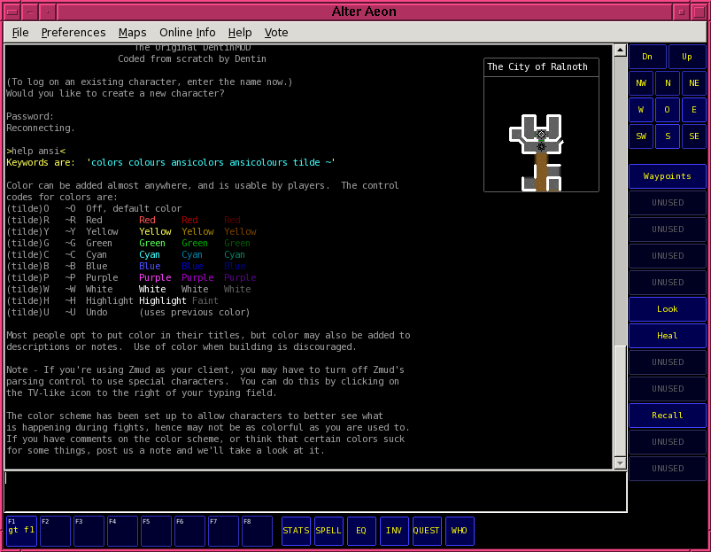
As part of my quest to improve the client, I accidentally embarked on sanitizing the button color scheme and making various colors consistent across the codebase. When this was done, it occurred to me to fiddle with them, and I ended up with some very interesting results, which you can find in the dentinmud.org screenshots directory.
Here's some direct links:
Red Alter Aeon Screenshot
Blue Alter Aeon Screenshot
Default Color Alter Aeon Screenshot
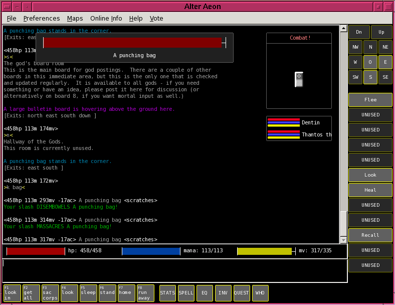
I personally like the blue a lot, but that's just me. A lot of players expressed concern at the blue layout or found it ugly. The red one was almost universally disliked, which I found surprising. Attempts to tweak it were really unproductive; for whatever reason, it seems very difficult to come up with red background color schemes that don't look terrible.
The current plan for the next day or so is to at least make these run-time selectable, though most players disable all of the buttons when they play anyway.
Strange as it may seem, I think the blue adds a whole new level of cool factor to the initial impression of the client. It's definitely eye catching, which is probably a good thing given the stunningly high dropout rates of people who try the client cold.
Saturday, October 3, 2009
Subscribe to:
Post Comments (Atom)
5 comments:
If you're still stuck on having the client a 1 file thing then there's going to be a very constricting limit on the amount of customization. Perhaps you could go so far as to have use a spritesheet for the client and then if a user wanted to customize it they could just edit the spritesheet to completely change the look.
The blue looks great.
but the font in the screen shots looks like shit. I hope that's not the default font.
Also, the default prompt for newbies looks ugly as well.
Although I am aware that some muds use the <34hp 40m 20mv> as standard, I think we should consider going back to our old one.
~G(%hphp %mam %mvmv)~O
Is what I think it was.
Shawn: I'd really prefer the download to be a single file executable without needing an installer, but I wouldn't be averse to having optional configuration packs.
Regarding sprites and integrated image files, I -really- want to avoid that if I can. Fixed images require rework any time you change some fundamental aspect of them, and I'd much rather just have things autogenerated/drawn if at all possible.
Image loading is one of the things I want to add last, because right now the interface layout is very much in flux.
Anonymous: The font in the screen shots are from the Linux/GTK build, which has totally goofy fonts to begin with. The default font is different under Windows.
That said, I don't know what a good default font actually is. I've always been pretty font agnostic, so long as it's clear and readable. I don't understand much of the obsession with it.
Regarding the prompt, new players starting out with the client have the prompt turned off by default. The built-in hp bars are used instead. (They can still turn on the prompt if they want.)
I really like the blue layout too, I think you're moving towards the right direction here. About the fonts, I personally like Courier New or Bitstream Vera Sans Mono Roman.
Post a Comment